load header here
Locktec Industries
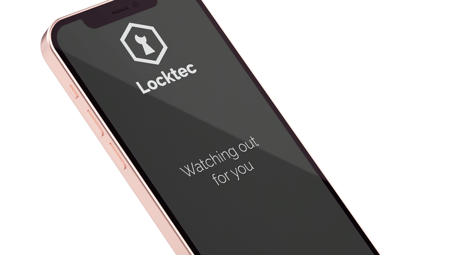
I created this logo for Locktec Industries, a commercial and residential security company. The client told me that the founder father was a locksmith, who mostly worked industrially at the beginning, but as their company grew, they would get more clientele that would ask for home security as well. They primarily offer security systems such as mechanical gates that can be controlled remotely, doorbells with cameras, wireless cameras, etc.
Challenge
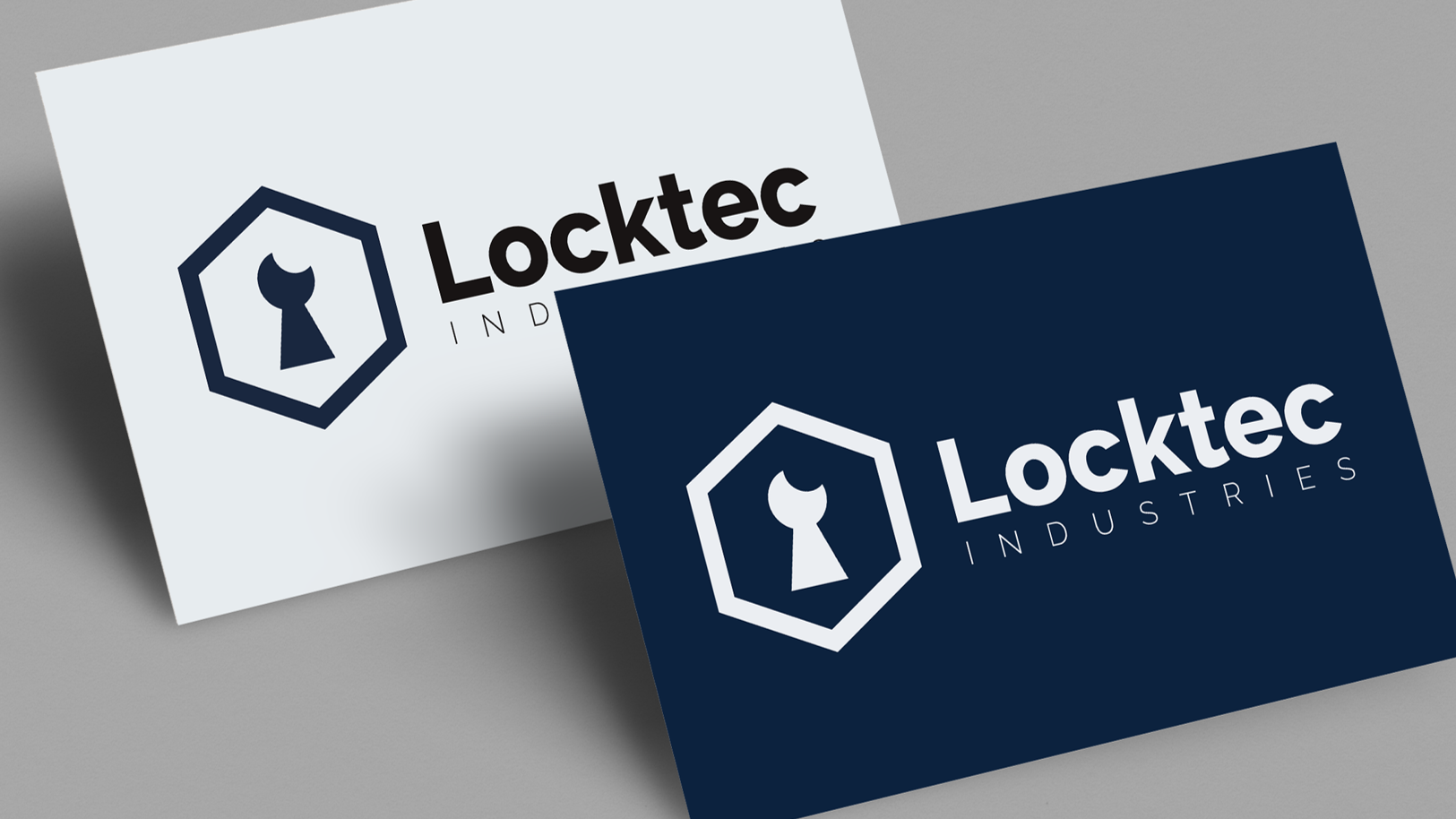
The client told me that their key values were strength, security, and safety. Some of their requirements for the logo were for it not to include a shield, have anything involving the color red, and for the company to not come across as intimidating. They mentioned they wanted to have shades of blue incorporated, for the font type to be bold and heavy, and be sans serif.
Solution
I stuck with the dark navy blue as the main color, with light grey and black as supporting colors. I used the bold sans serif font that they wanted for the official name of the company, but in some variations added a thin font for ‘industries’ to go along with their idea of not coming across as too intimidating. I included the keyhole and the hexagon so that it is obvious that this is a security company.